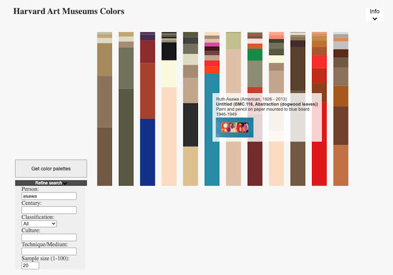
This project is a web app that displays color palettes of a randomly selected group of objects from Harvard Art Museums' collections.
The app was developed in several stages. The first step was to graph the color data – represented in the records provided by HAM's API – using the Matplotlib Python library.
Each record contains up to 10 colors, along with a percentage of the image that was detected to contain the color. These values are graphed using Matplotlib into stacked percentage bar charts, from the highest percentage on the bottom in descending order toward the top.
Since not all records contain color data, a different number of palettes are displayed each time the script is run, the "size" parameter to the API serving as a maximum sample size.
The next step was adapting the Matplotlib script into a format that could be displayed in a web browser. This was done by incorporating the MPLD3 library, which allows Matplotlib charts to be displayed in a browser.
The library includes Javascript tooltips which are displayed on top of objects on mouseover; for this project, tooltips were used to display a tombstone label and thumbnail image for each work.
An additional Javascript function is used to display links in a new window when items are clicked.
The last step was to package the MPLD3 script into a format executable as Python in real time on a server, in response to user input. This was possible using Flask. Using this example
the script was formatted into a series of files displayed by the Heroku platform.
A further direction for this project may involve expanding the corpus to include images without preexisting color data. The OpenCV computer vision library could be a viable option in this case for detecting color data from examples found on the web. This adjustment would allow images to be collected from more sources, including other museums and libraries.
Harvard Art Museums Color Palettes
By: Jack Patterson
