Brief
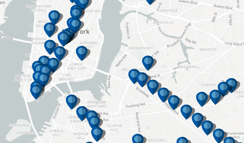
This project is a simple Python web scraping and data mapping practice. It is an assignment of my Python class at Pratt Institute: Programing for Culture Heritage, instructed by Matthew Miller. This project was my first attempt to scrape the web for a raw data and to visualize it. In this project, I scraped the MTA Arts and Design website and get a basic dataset of MTA's subways station, and picked the categories with basic location information, and combinedthem with a MTA geographic information dataset, and used Leaflet.js to map them out. With this map, you can get a sense of the amount of MTA's art collection, and where they locate in the New York City. You can click on the pins for the following information:- Station Name
- Art Work Title
- Artist Name
- A link to the original MTA webpage
Origin
This project began with one of my personal interests. My earlist motivation was the buskers who are active in the New York subway stations. Although they lives a hard life, they spread a possitive attitute and inspire me all the time. I wanted to do create a dataset thatsomehow shows their activity, their life, and any other information about them. However, it was a fairly difficult goal, for the reason that buskers, are usually not 'famous', and there were hardly no information that describes where a specific busker usually conduct his/her performance. The closest project I found was busk.co, who has almost done what I wanted to do. Even though, they could only locate each busker to a city range. I also tried Twitter, see if I can scrape busker information from there, but most twits about buskers has descriped location information ambiguously. So that I pivotted to the subway art works. With professor Miller's suggestion, I started using the MTA Arts and Design index as the base of my project. There were three main chunks of this project: Data Scraping, Geo-info Matching, and Mapping.Data Scraping
As a total newbie to the programing field, using Python to scrap the web was the most challenging part. There were roughly three steps of my scraping process:- scrape the urls on the index page;
- use the urls to visit each art works' detail page and scrape the station information;
- avoid unrelevant art works like music or posters that has no station information;
Geo-info Matching
In this step, I realized that in real life, most data are 'dirty'. The json file I scraped looks like this:{ "artistName": "Vito Acconci (Acconci Studio)", "url": "http://web.mta.info/mta/aft/permanentart/permart.html?agency=nyct&line=Q&artist=1&station=26", "type": "Percent for Art", "station": "West 8th Street-New York Aquarium", "title": "Wavewall, 2005" },You might have noticed that the station name
"station" : "West 8th Street-New York Aquarium"comes with a very descriptive language, while most MTA station data has their station like this
W 8th St - NY AquariumI tried to use Python to replace the values such as street to St to Street, but only a few can be really fixed, so later I had to spend a whole afternoon to manually checked each station names in the json file.
Mapping / Visualization
With the data I got, I used javaScript and the JS library Leaflet.js to mapping it to an html site. With the .marker and .bindPopup functions, I mapped the data to the site, and when you click the marker (pin) you can see the station's art collection.Acknowledgements
- MTA ART Data Source: http://web.mta.info/mta/aft/index/
- Subway Station Geo-info Source: https://data.world/new-york-city/subway-stations
- Mapping Tool: https://leafletjs.com/
- Map Provider: https://www.mapbox.com/
Project Review
This is still a very childish data visualization project. If I got more time, I might want to add a toggle function to show the pins in different ways (see image below), I assume that can provide more interesting insights to the data. What's more, the current json doesn't have enough detail information, it was because many artists in the MTA art collection are not quite famous, and adding their information to the map will require a lot of investing of time.
After this project, I realized that the hardest part of data visualization was not making visual decisions, or find the right data, but the processing of data. It is because 'data are usually dirty'. This time it's a 200 lines of data and it took me a whole afternoon to check it, but in real life this number could be 2 million lines, and that's where we really need programing kicks in. All my thanks to Professor Matthew Miller, without his patient explaination I will be lost in this strange field months ago. And special thanks to my friend Teng Cui who answered a lot of dumb questions in Python and JavaScript.
