Plotting Discogs Data in Plotly
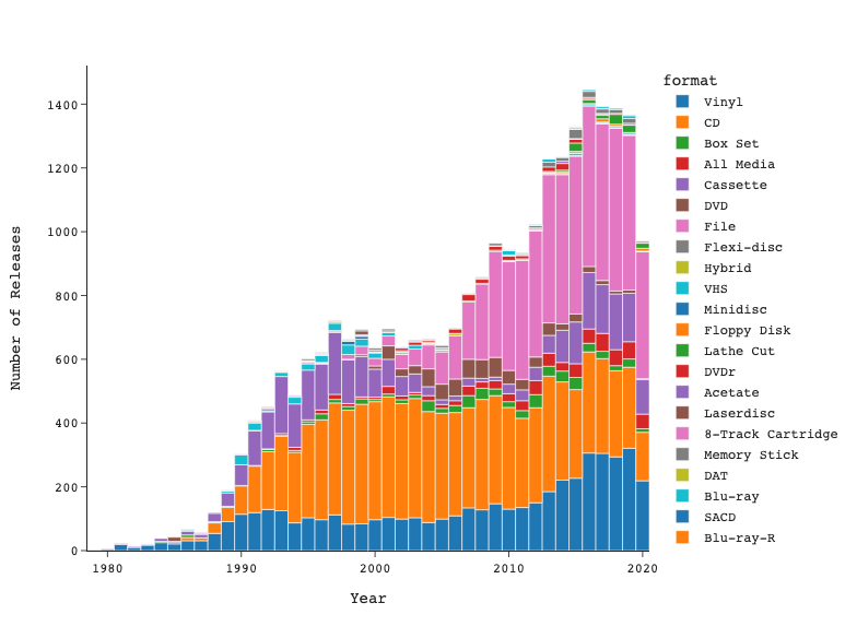
By: Alyce Currier
Final project for INFO-664: Programming for Cultural Heritage at Pratt Institute. This project offers a starting point for visualizing music data from Discogs. The data is first cleaned using Pandas, then visualized using Plotly Express and exporting the graphs to an HTML file. For the example graphs, I visualized the techno genre, and saw some interesting trends in how formats have changed over time. Others could easily repurpose this code to explore broader datasets or even more genres. The repository also includes a script for pulling further information on one random release, which automatically refreshes every 5 minutes.
