Hard to Count Populations and the U.S. Census: Exploring Correlation Between Response Rate and Funding
By: Michael Kelly
This project uses publicly available Census Bureau data to explore the correlation between response rate and resource allocation as tied to the decennial U.S. Census and American Community Survey (ACS), with an eye specifically on different populations at the state and then national level.
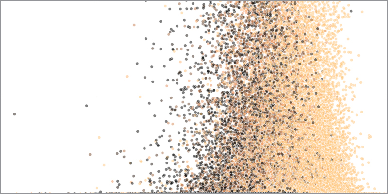
Of course, the process of allocating funds is complex, with many factors. For manageability, this project plots 2010 mail-in rates (taken from the Census Bureau’s Planning Database) in relation to aggregate Community Development Block Fund Grants (CDBG) as representations of response rate and funding, respectively. (Based on my research, these were the most closely linked and indicative.) Tract markers are then color-coded according to percentage of the combined hard-to-count populations of Black and Hispanic.
Python was used to extract, transform and load, utilizing CSVs available online, and the Seaborn and Matplotlib libraries were used to generate the scatter plots. However, while visualization is a large part of this project (and its exploration and refinement was time consuming), I came to see its role as exploratory, and not as a public-facing expression of census justice for a broad audience. The code is a kind of customizable tool, in which one could update just a couple of fields and generate comparisons, or confirm informed suppositions. For this reason, every effort was made to keep the project self-contained within Python, without the use of separate visualization software.
