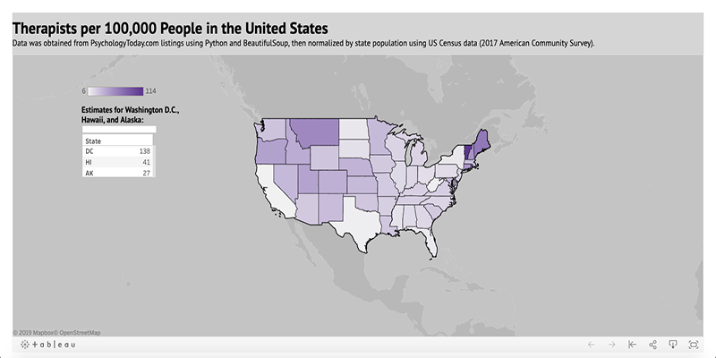
For my project, I wanted to see how many therapists there are per state in the United States to assess which states have the most access per 100,000 people and which have the least.
Writing the Script
First, I needed a way to iterate through each state's listings of therapists on PsychologyToday.com using the BeautifulSoup Python Package. After attempting to go through search results by just searching for all therapists in a state, I realized that the listings were constantly randomized and didn't actually have a specific list when going through regular search. I then discovered that the website also provides an alphabetical listing of therapists per state, with consistent URLs showing the state and the corresponding letter in the alphabet (for example, all therapists with a last name that starts with "r" that live in Vermont are under the URL https://www.psychologytoday.com/us/therapists/profile-listings/vermont/r). After figuring this out, I created a Python list that included each state URL corresponding to each letter in the alphabet. I also left out any nonexistant URLs: if a state didn't have, for example, any therapists with a last name that starts with "q", then I made sure to not include a URL corresponding to that letter for that state.Running the Script
Once the list was finished, I made sure that my Python script successfully iterated through each page by spot checking random URLs in the list. Once I confirmed that it worked, I let the script run to scrape all of the info I needed for the project, a process that took about 4 or 5 days. As the script would abort for various reasons, usually because my internet at home stopped working or because I was missing a comma or hyphen in a URL, I was finally able to produce 6 JSON files of data.Cleaning the Data
Once I had all of my JSON files, I imported them into OpenRefine for some data cleanup. Aside from removing all phone numbers from the data and making sure each address had a corresponding state, the files themselves were already in pretty good shape.Visualizing in Tableau
I decided to go with two visualizations for this data: a map and a bar chart.Because I didn't want to just show a map of population, I divided the number of therapists in each state by that state's population according to the US Census, then multiplied the answer by 100,000. This shows how many therapists are available per 100,000 people in each state.
This view shows the same data in the form of horizontal bar graphs. This gives a better idea of which states have the most therapists per people, with Washington D.C., Vermont, Rhode Island, Maine, and Montana coming in at top 5.
My original intention was to geocode the addresses in here and then map them out by point to explore which states don't have as much access to therapists when measured by distance. This requires further analysis and a different dataset, which I'll be using in another class.
